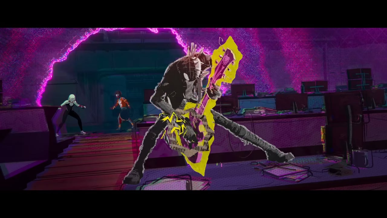
If you've seen Hobie Brown, Spider-Punk in the excellent Spider-Man: Across the Spider-Verse, you’ll have seen how jagged and chaotic he looks. And ironically there’s a fascinating and very ordered system behind it all.
Spider-Man: Across the Spider-Verse is easily one of the best entires in the MCU canon for several years and, along with WandaVision, probably one of the best things Marvel has ever done off of the comic page. As well as being a genuinely excellent movie that deals with the intricacies of multiple worlds in a much more level-headed way than the live action films have managed, it doubles down on the work of its 2018 predecessor, Spider-Man: Into the Spider-Verse, in shaking up American animation from its slavish recreation of the Pixar look with a riotous kaleidoscope of different styles.
And none are more riotous than Hobie Brown, the anarcho-punk Black British Spider-Man from Earth-138, also known colloquially as Spider-Punk. Not only does he steal good chunks of the movie though, he also looks absolutely chaotically unhinged, with an animation style that’s a perfect nod to Sex Pistols designer Jamie Read.
Its not random though, it’s actually carefully crafted as a Twitter response from animation lead Chelsea Gordon-Ratzlaff illustrates.
these were our rules for hobie!
— Chels (@cgratzlaff) June 5, 2023
- body on 3s
- offset the vest (also on 3s but delayed by a frame or two)
- guitar on 4s
- outline on 2s (only when he’s moving, should remain static when he’s held still)
- cutout around the guitar
of course we broke these rules when needed 🤘 https://t.co/y3HqFIlJMF
So, that's:
- body on 3s
- offset the vest (also on 3s but delayed by a frame or two)
- guitar on 4s
- outline on 2s (only when he’s moving, should remain static when he’s held still)
- cutout around the guitar
And of course they broke those rules when needed 🤘
This is why Hobie looks quite as wild as he does. Animators typically charge poses and details every second frame, in other words on the 2s. But not only is Hobie animated differently to the rest of the cast, giving him a far more choppy look with movement on every third frame, but all of his separate elements move on separate frames too. And they all had different textures as well which changed from scene to scene, emphasising the discordant elements even more.
Blink and you’ll miss his intro at around 59 seconds below. Oi oi!
h/t to Polygon
Tags: Post & VFX


Comments