Replay: Is it possible to make any sort of objective criticism of a grade? Simon Wyndham doesn't think so.
So, you've spent a while grading an image and put the final video out. Some people love it, some people have criticisms, some people like it but 'don't like the colours'. Hang on, what?
Sometimes criticisms like this are valid within the confines of subjective reasoning, but at other times they fly in the face of all logic, particularly when the criticism states that your grade is biased towards a particular colour that bears no scrutiny on the scopes. A recent video I did had comments about how trees looked green. And yes, that's possibly an accurate observation given what trees tend to have attached to them. But they were referring to the tree trunks and branches, which any person familiar with trees would note is due to the bright green moss that adorns them.
The lack of ability of some people to objectively reason through such things using, well, their eyes, can be incredibly frustrating. On par with a corporate client who asks you to film their grey building on a dull, grey day, with their silver Audi parked out front, and then message you after the first edit asking why there isn't more colour in the shot.
The fact is this, whether or not you like a grade or the colours in the shot is a very subjective thing. Although if you're going to tell someone there's a ton of magenta in the shot, you should at least take the time to prove it in an objective fashion.
Creativity and realism are not the same
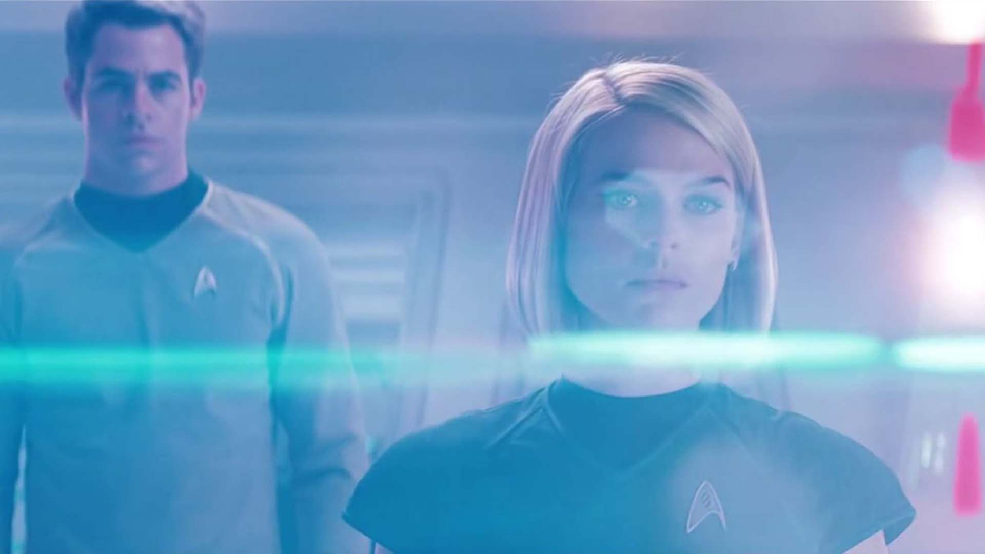
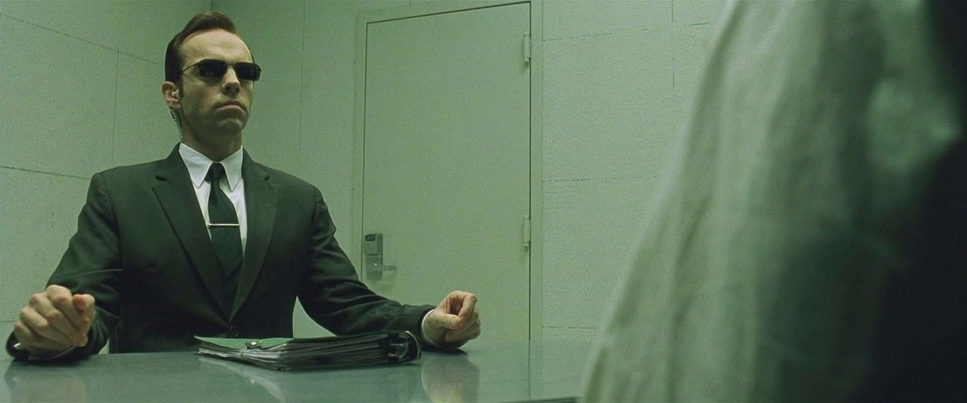
The funniest criticisms, though, happen when a shot is given 'character' or a 'look'. This could be anything from a bleach bypass emulation to the green of The Matrix, to the OTT lens flares of Star Trek (yes, I know it was done in-camera). Any one of those stylistic decisions could be called errors. In the past, cinematographers would have gone to great lengths to eradicate all traces of flaring. Yet now it is often a desired effect. If The Matrix hadn't happened in 1999, and some random YouTuber had come up with a similar look now, people commenting on the video would tell them how awful their colour balance was. In other words it is now accepted because it has already been done by a big Hollywood director.

Green. Lots of green.
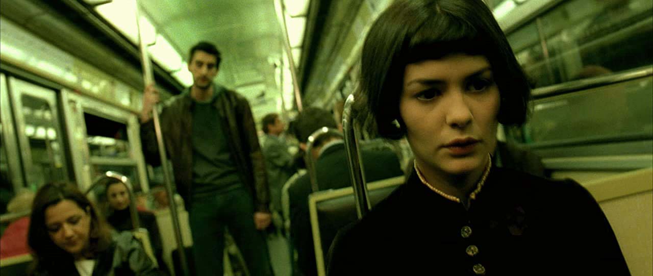
In fact there are a whole host of films that have contained influential looks over the years, from Amelie to Seven, to the very first digitally graded film O Brother, Where Art Thou, which, if the grades had been done by lesser individuals for YouTube, would have been criticised for having terrible colour balance. Cries of "There's too much red!" or "Your shadows are green!" would have adorned the comments ad infinitum.
It seems it can be impossible to win. Give your image a totally neutral look with contrast that brings out every detail and you could be accused of being boring. Do the opposite and you get told your colour balance is wrong, even though as the person doing the colourising you quite like it.

You can never have enough green. Amelie.
The thing is this. Art isn't realistic. If you are aiming for a look then you aren't aiming for realism, you're aiming to connect with an emotion. And yes, experienced colourists are masters at creating some extreme looks whilst still keeping things believable, but at the end of the day, no matter whether you're a YouTuber or a big Hollywood colourist, the look is your creative decision. Some people might disagree with your choices, they might even hate the look you've created, but your grade can never be objectively 'wrong'.
Many film stocks do not replicate colours realistically. If they did, all film stocks would look exactly the same! I've taken recently to using the halation plugin within Resolve. Ordinarily I would make the effect extremely subtle, but on this one occasion I exaggerated it because I liked the effect it gave in certain instances. My choice. There's a school of thought that says halation should always be very subtle indeed. But if you look at real productions shot on real film, sometimes the halation is very prominent. I can think of a few instances in The BBC TV series Spooks, which was shot on S16mm film, where the halation was very pronounced. This wasn't due to a post effect, but a result of the film stock itself. If you ever watch the scene with the demise of the character Lucas North (Richard Armitage), watch for the extremely prominent halation as Harry Pierce (Peter Firth) walks to the edge of the building to see what has happened.
There are many other instances throughout the series, where, if the same amount of halation was added digitally today as it appeared in the scenes in Spooks shot on S16mm, the colourist would dial it way back, thinking that it was far too exaggerated.
If you don't like a grade, be less like the grading police and perhaps make constructive points instead.


Comments