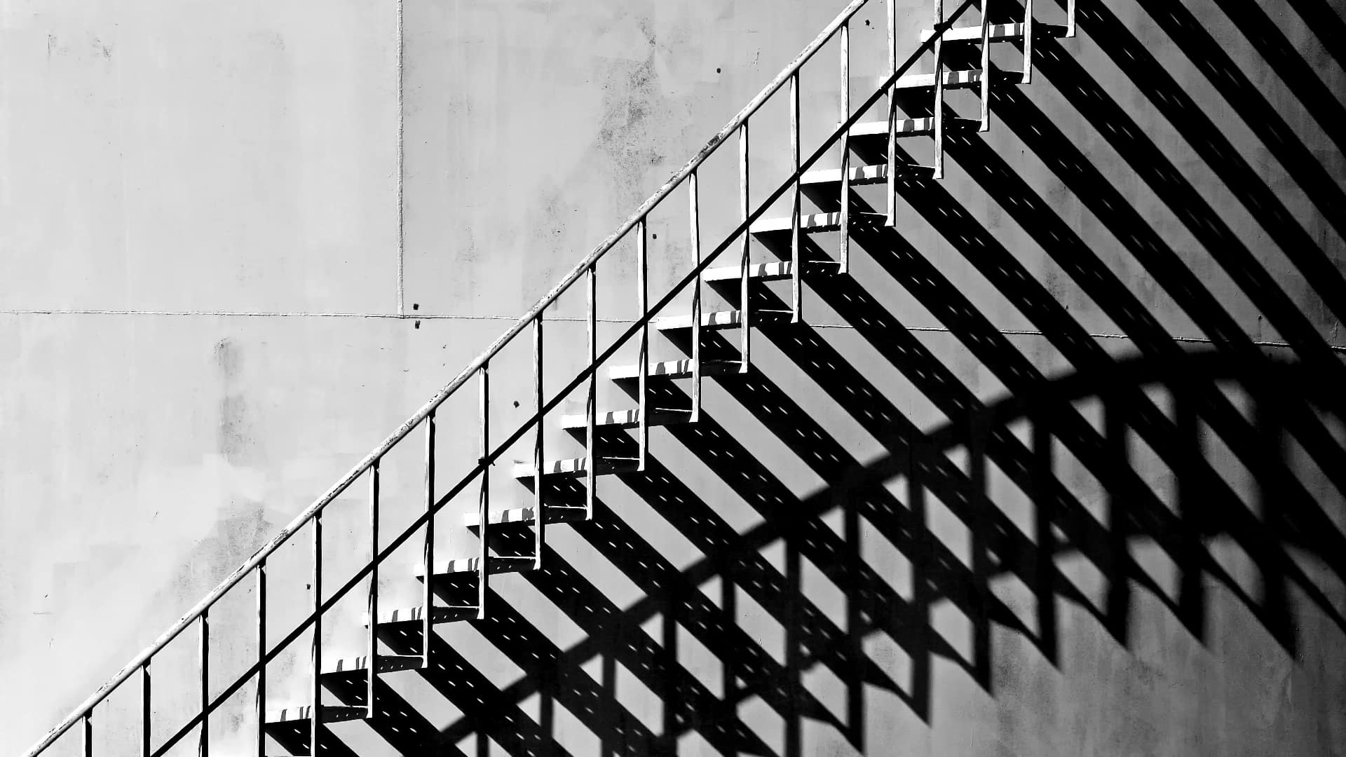
Rakesh Malik on the importance of embracing the dark side and using shadows to their full extent.
In both photography and cinematography, the focus tends to be on exposure. That should come as no surprise, since cameras can figure out exposure on their own, so getting a “good” exposure is quite easy to do. Many beginners and weekend warriors are satisfied with that, but those who are pursuing careers as motion or still photographers need a deeper understanding of lighting than that.
Over the years I've encountered both photographers and cinematographers who insist that you should not be able to see shadows in the frame. This is an easy claim to debunk: go outside during the day and look around. Shadows abound, because objects cast them. Go out at night in a city, and odds are you'll see even more shadows since each object will cast a shadow for every street light that's illuminating it.
Shadows are part of reality, so they should exist in pictures.
Now that we've taken care of that, we can start thinking about using shadows in our art.
Dimension
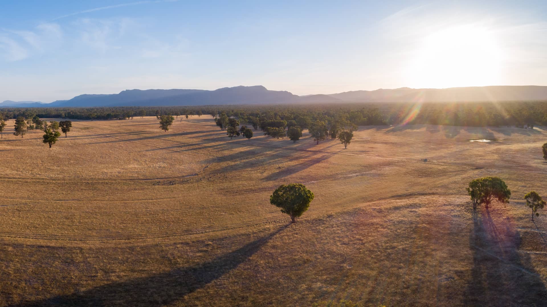
Shadows help to reveal the shape of three dimensional objects, as well as their textures. It's because of shadows as much as for the golden light that landscape photographers so strongly emphasise magic hour lighting; side lit mountainsides look far more dramatic when the shadows delineate the shapes and details of their spires and crags than when they're evenly front lit, because those very crags and spires blend into the surrounding mountainsides. The side lighting also helps to reveal subtle textures that often aren't visible at all by creating shadows that reveal the shapes that comprise the texture.

Shadows change landscapes entirely. Pic: Shutterstock
Hard or soft?
When we're talking about hard vs soft light, what we're really talking about his how hard or soft the shadows are, determined by how large the light source is in relation to the subject accounting for perspective. The closer the light source, the bigger. A 3x5cm LED panel is a huge, incredibly soft light source for a macro, a small light source for a house cat, and a tiny light source for a human. This is due to the fact that for a macro subject the light would be up close to a tiny subject, but for larger and larger subjects, the light has to be farther away to cover the subject. The small LED could still do well as an eye light, and become a soft light by shining it onto a white wall or through a silk, though odds are it won't be bright enough to serve as a key light.
Contrast
The contrast is determined by the lighting ratio, which is generally described as the ratio between the brightness of the key light to the brightness of the shadows. The cinematographer decides on that ratio based on the tone and emotional needs of the story. A light hearted comedy might have fairly bright shadows that serve only to provide dimension to the actors and depth in the scene, while a film noir might have vast swathes of darkness dominating the frame, and even the shadow side of actor's faces fading into inky blackness. Soap operas and Hallmark Christmas movies tend to go even farther, with the actors lit to look bright and glossy like... well, Hallmark Christmas cards.
A lot of photographers like to take softboxes and position them relatively close to their subject's face for portraits. This yields a pleasing look where the light wraps around the subject's face and casts semi-sharp shadows, leading to Rembrandt and butterfly lighting. However, a lot of these photographers also end up doing a lot of retouching using frequency separation in their photo editing software to soften the pores on the subject's face.
A quicker and easier way to smooth out the pores on subject is move the softbox back farther and use a brighter light, which may also require a larger softbox or silk. This is due to the inverse square law of light falloff.
Say the subject's face is 20cm wide, and the softbox is 20cm to the right of the subject and positioned with the far edge even with the subject's face, letting the light wrap around the subject's face. Now the left side of the subject's face is twice as far away from the light as the right side, so the light's brightness has dropped to 1/4.
Move the light to 40cm from their face, retaining the wrap around by keeping it positioned with the edge alongside their face, and now the the left side of their face is 30cm, only 1.5x farther than the right side and therefore 1/(1.5^2) or .4x as bright, which is less than the previous dropoff to .25x. Move the light to 1 meter from the right side of the face, and the left is now only 1.1x farther, so the dropoff in light is even more gentle across the subject.
In addition to affecting the shadow depth, having the softbox farther away also softens the light. This can be carried to an extreme to turn the soft light a nearly shadowless fill light, though that requires both more powerful lights and a larger diffusion surface, but when used for a key light, it also helps to soften texture in skin like pores and even minor blemishes.
Placement, depth and realism
Every bit as important as how soft the shadows are is where they are. Position a light in front of and above a subject to create a classic beauty light, with shadows enhancing the look of their cheekbones, and move it to one side to turn it into a Rembrandt light. Rembrandt light doesn't exist without a shadow. Move all the way to one side of the face and keep it close to their face to create a split light, great for a villain in a spy movie.
Shadows can also enhance the art direction, for example by casting shadows of branches onto a background, creating texture on a blank wall. Letting an entire room fall off into inky black shadows can evoke feelings of menace and mystery, while letting the room fade to the ambient light level allows the viewer to absorb the setting. Then add a directed beam of light to add just a little bit of brightness to an element to subtly draw the viewer's attention to it, which can be a great way to give the audience a subtle hint, or even draw attention to a character's environment.
Since real world lights cast shadows, there's no reason that film lights can't also. Sometimes it's preferable to keep the shadows so soft that they're essentially nonexistent to maintain a lighter mood, but in most dramatic and thriller films visible shadows make sense; the catch being that they have to match the lighting, so that they don't confuse the audience. Like animation, we are all trained by life experience to see shadows in the real world, so while it feels correct for a key light to cast a shadow, it doesn't for a fill light to cast a shadow. In a scene lit by street lights, it's ok to have multiple motivated shadows.
Don't avoid shadows. Use them.
Tags: Production Lighting


Comments