Replay: While technology advances at an exponential rate, filmmaking styles and techniques tend to oscillate back and forth. As resolution and dynamic range increases, filmmakers seek to soften and degrade images. The pendulum swings between glamourous pictures and naturalism. But what is a gimmick and what is art?
Often these trends are just a reaction against what has gone before (no one wants their video to look like video any more), but sometimes it's hard to separate what are real advances from what is merely fashion.
Flares are back in fashion
Many elements that were considered flaws in the heyday of film are now considered desirable, like lens flares, grain and anamorphic distortion. I’ve even seen focus pulls on lenses that exhibit extreme ‘breathing’ used as a deliberate dramatic effect. Why do we acclaim effects that were once avoided? I’ve seen old film lenses once were scorned for being notoriously soft proclaimed today for their ‘character’. Sometimes this is to legitimately evoke the look of a particular period of cinematography but often it is a desire to evoke a lost era of cinema, which can be a bit of a romantic myth.
Take lens flares: there are times when lens flares really add to the story; they can help to recreate the glare of a bright sunny day or, at night in a noirish thriller, a sense of being chased or lost in a cityscape – the audience becoming the proverbial ‘rabbit in the headlights’. Already I think the trend for uncoated lenses may have peaked, and they are beginning to seem like a cliché. My heart sinks when I see lenses marketed with what are effectively ‘built-in’ star filters. The problem is, of course, once you have those flares you can’t take them out. The novelty soon wears off.
The particular distortions associated with anamorphic lenses are considered ‘cinematic’ but, in the heyday of Panavision and Cinemascope, they were unfortunate side effects of the desire to make cinema screens wider. The irony is that if you aim to deliver a 2.35:1 aspect ratio today (whether by using anamorphics or simply cropping) you are ending up with a smaller picture on a 16:9 screen, and it’s on a 16:9 or squarer screen that the vast majority of our work is going to be seen.
Can shallow depth of field ever be funny? Can deep focus be erotic?
Shallow depth of field is very seductive. It separates subjects from the background, it beautifies the image and makes the sharp areas look sharper. The look is the opposite of home movies and light entertainment TV. It is great for interviews where the background is often irrelevant or distracting. It’s also particularly appropriate in a drama where the character is isolated from the world which they inhabit.
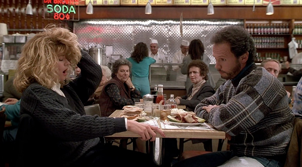
 When Harry Met Sally, a prime example of when shallow depth of field would be a detriment, preventing the audience from seeing the reaction of other people.
I once wrote that the difference between erotica and pornography is that the former has shallow depth of field and the latter deep. But there are other genres where we want as much as possible to remain in focus.
The opposite approach, deep focus, was once praised as a breakthrough. A specific example where shallow DoF may not be appropriate is comedy. The classic comedy character, as screenwriting tutors will insist, is one who is oblivious to his or her own flaws, and thus often unaware of what is going behind or beside them. The audience needs to see what the character does not. In documentaries, the context is often all important; we don’t want to isolate the subjects, we want to see the world they inhabit.
The ever present back light
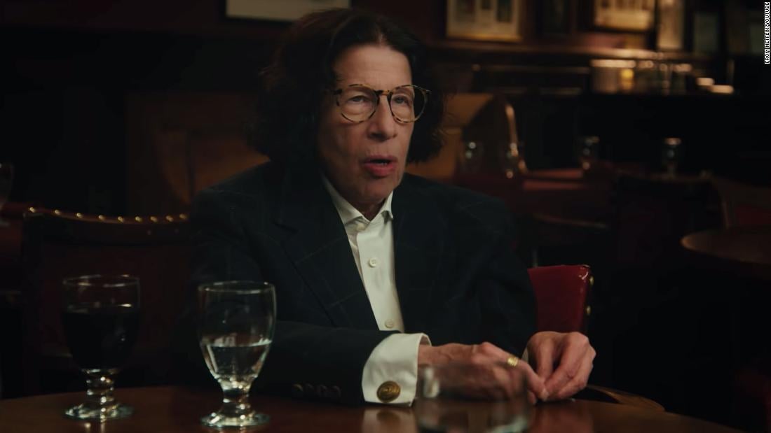
If you’ve ever read a introduction to photographic lighting you will be familiar with the triumvirate of key light, fill light and back light. For years subjects in movies would have a backlight wherever they went. Westerns were shot with the ‘two suns’ principle, with close-ups arranged so the subjects always had the sun behind them. Backlights, like shallow DoF, separate the character from the background, they make nicely defined images. But very often, they look artificial; like hard lighting, they cry out ‘this has been lit’. As trends go towards naturalism, cinematographers increasingly ask ‘do we really need that back light?’ – and the answer is often ‘no’.

Martin Scorses' 'Pretend It's City' - where's the back light gone?
There’s a technical reason here too; in the days of standard definition TV with very limited dynamic range, high key lighting ensured the pictures would be watchable around the world; anything that was too dark or ill defined might disappear altogether on some screens. There was always a fear that a character with dark hair would disappear into a dark background. Now with vastly improved televisions filmmakers are prepared to take that risk and, if they want the subject to stand out against a background, work with the art and costume department rather than just relying on the ever-present back light.
So the pendulum swings back and forth. As resolutions get higher and lenses sharper, filmmakers want to soften the image to add some mystery to it, to give space for our imaginations to work. And when things get too fuzzy, a movie that offers eye-piercing clarity seems like a refreshing innovation. If we get too much gritty realism, we long to escape in the glamorous artifice of classic Hollywood; too much of that and we long for simplicity.
Manufacturers like to tell us that if we buy their camera or lens we will achieve the sought after ‘cinematic’ or ‘organic’ look, in actual fact there is no such thing. There are as many ‘cinematic looks’ as there are movies and if you want an ‘organic’ look, I suggest you contact the Soil Association. Techniques should be used because they tell the story, everything else is mere decoration.
Tags: Production Opinion


Comments