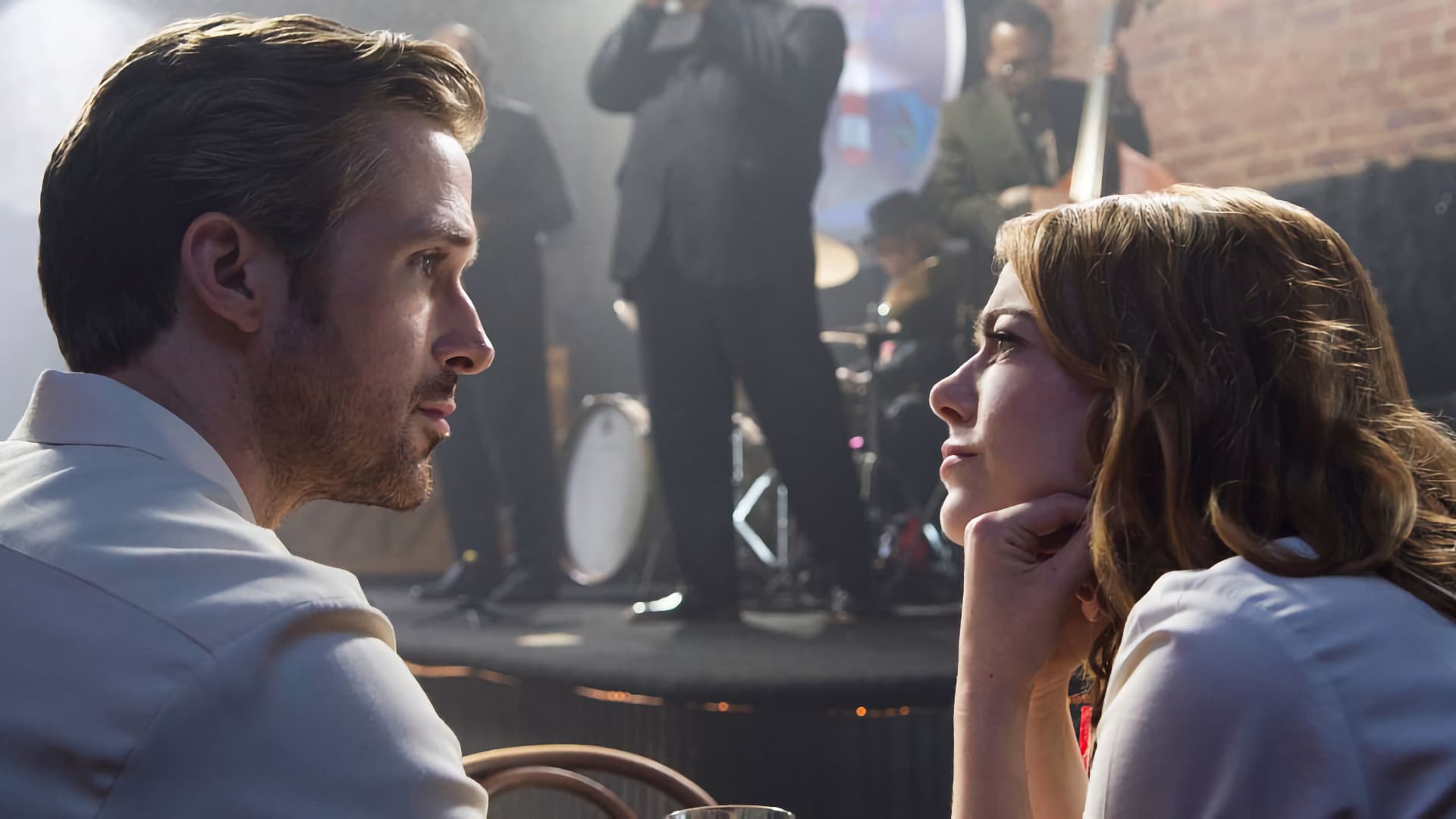
No matter what kit you’re using there are some basic components to the cinematic look, and the list starts with making a clear division between your subject and its background.
There’s a disconnect, sometimes, between the fact that everyone knows that the technology and technique of camerawork don’t necessarily have much to do with each other, and the fact that people so often behave as if they do. People vacuum up articles with titles like How to Make Camera X Look Cinematic, but it’s much less clear whether there’s any real need for separate discussions of that based on whether Camera X is an Alexa 65, an old DSLR, a Beaulieu 6008 or a bunch of grapes.
Let’s not quibble over whether there’s any widely-accepted meaning of the word “cinematic” (there isn’t) or whether the finer points of it are really defined by anything more than habituation and fashion (they aren’t). Instead, let’s jump directly into some of the things which work with any camera you like; the downside is that some of it requires a stepladder and some prep time, but it’s all an effective libation upon the altar of the cult of cinematic.
Elders of that particular photographic cult will view this as basic and have opinions, of course, and that’s what the comments section is for - but this is the first in what might become a series of articles which together represent a genuine attempt to boil this most perpetual of subjects down to some genuine fundamentals.
Part the First: Separation
Some guides to making pretty pictures will emphasise selection of locations, and they’re not wrong. Others will emphasise lighting, and they’re also not wrong, and neither is anyone who emphasises framing and composition. In a desperate attempt to sum all these concerns up, though, maybe the right word is separation.
A quick squint at a representative selection of frames from Shotdeck or Film-grab, though, suggests that what makes simple sit-down dialogue scenes look like movies is a clear division between subject and background. Lighting matters because it generally involves backlight. The location has to be big enough to get light on the subject without inappropriately illuminating the background. Framing matters because it controls the background.
It also doesn’t hurt if the background is darker and cooler in tone than the subject. Practically all modern building interiors, of almost any kind, are bright in tone, because it maximises visibility and the efficiency of room lighting. The last few decades have seen precious little variation between what the 70s called pale brown, the 80s and 90s magnolia, and now the terms are mushroom and eggshell, but shades of off-white, tan, beige or cream is the perpetual result.
Look at Sicario, though, some of which takes place in what’re effectively just offices, and it’d be easy for alien scientists to conclude that cold blue-grey is a popular interior design choice among homo sapiens. The only interiors which are that dark in reality are high-end hotels and other places in which practicality takes a back seat to making life feel, quite literally, more like a movie. Old, oak-panelled interiors can be suitably gloomy, but modern interiors are almost universally bright. Finding a place that we’re allowed to repaint has always been an absolute boon to the impoverished production designer.
Deficiencies here can be rectified, to some extent, by careful lighting; pump enough photons into the talent and they’ll be well-separated from a less-lit background, although maintaining that difference in light level, in such a way that the talent can move around and keep looking good, can start to require a lot of space.
Similarly, consider colour temperature. A huge spill of daylight onto a white-walled background might be hard to control without solids the size of a postcode area, but put a high-power tungsten key onto the foreground and suddenly that dull overcast is a steely background wash by comparison. Yes, that may require some quite high power keylights to stop the daylight dominating, but in a world of high-power LEDs, a bit of punch has never been more affordable, and it any case it’d be no bad thing for most of the film industry to rediscover the increasingly lost art of lighting to a high level.
Directing attention
If all this sounds like an attempt to tell the audience what to look at, well, yes, it is, but it’s also something that cinemagoers are used to. Do these things and standard techniques around kickers and hair lights become the icing on the cake as opposed to a desperate attempt to save a setup where the talent otherwise risks receding into the gloom. If three-point lighting seems like your grandfather’s approach to proper exposure, consider that moodier looks often involve what’s effectively a three-point setup after having tossed a coin in order to decide whether to omit key or fill.
Much as all this requires choreography of production design and camerawork which might seem like a nuisance, all of it is also effective with every kind of camera, from 65mm Kodak negative to experimental lightfield arrays to cellphones that have everything in focus from the dust on the lens to the moon.
If it seems like there’s an aspect of separation that we haven’t considered, there is: it’s the use of depth of field, fog and smoke and parallax, which we’ll consider next time, when we discuss Part the Second: Depth.
Tags: Production


Comments