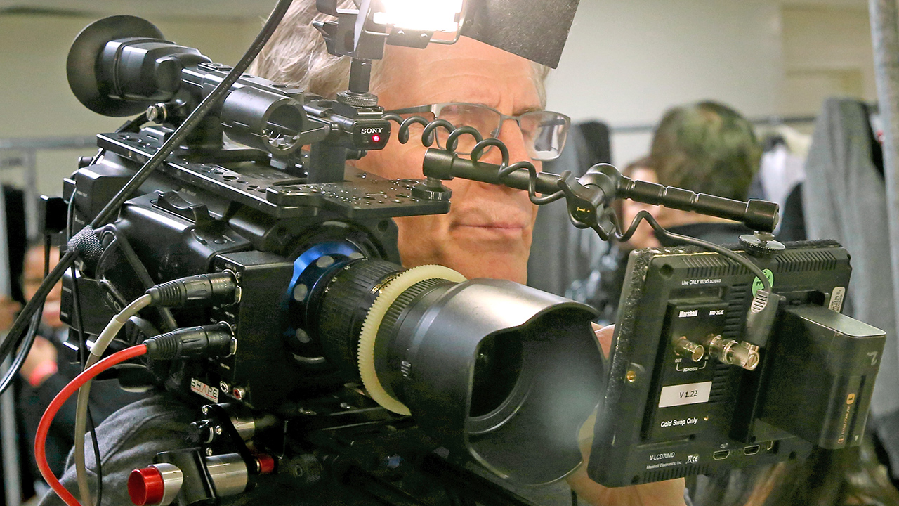
Replay: Is current camera design beholden to dogmatic assumptions about how things should be, or is there a better way? Roland Denning unleashes his opinion on what manufacturers should really consider when they put their digital pens to the design screen!
As you might have gathered in my ongoing review of game-changing cameras over the last 90 years, camera design tends to evolve slowly and conservatively. This is not a bad thing as we all want familiar designs that are intuitive to use. Sometimes, however, market forces – or just manufacturers’ misjudgement – skews the process of evolution. Sometimes, familiar forms have continued irrespective of the fact they are no longer relevant and we find ourselves asking – just what went wrong here?
Assumptions
Design carries with it certain assumptions. Look at a traditional professional video camera: made to be gripped with the right hand with a viewfinder on the left. The assumption here is the camera operator is right-handed and right-eyed. Left-handed camera operators are an oppressed minority. Or maybe left-handers just take up alternative professions.
Look at another aspect of video cameras we take for granted: audio gain controls under a plastic flap on the left side of the camera body, a constant irritation for sound recordists as meters and dials are behind the operator’s head. It is clear that the classic ENG/PSC cameras were designed with one-person operation in mind, even if this is not how they are used in the field. And have you questioned why those gain controls are hidden behind a flip-up plastic flap? They were not always that way! Older readers will remember that, on earlier cameras, those controls were free to turn, so crews would tape over them to hold them in place. The plastic flap is simply a manufacturer’s upgrade to replace that piece of camera tape. Could we design controls that would not be nudged accidentally but were still convenient and fast to adjust? Of course, but we now expect them to be beneath a plastic flap and few manufacturers dare to challenge that convention.
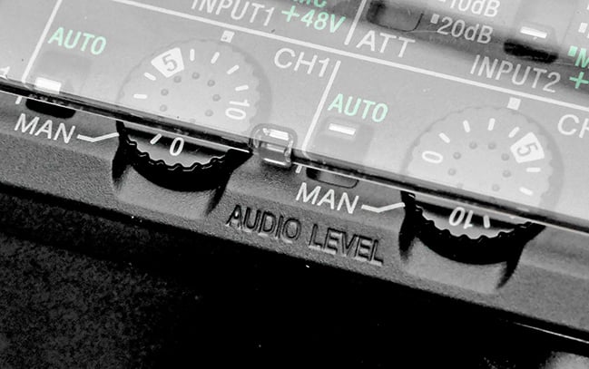 Surely there's a better solution than these annoying plastic flaps?
Here are some more pet peeves about camera design:
1. The handheld video camera which can't be handheld
In the consumer world there are ‘palmcorders’, small and light enough to be clutched in the hand like a baby bird. I’ve got nothing against those. My problem is with professional video cameras that can weigh 3kg to 4kg loaded up, but are still designed to be supported by your wrist and arm. However young and fit you are, you can’t hold that camera steady on your extended arm for very long. As the viewfinder on these cameras is in line with the lens as opposed to offset to one side (Why? A throwback to days of optical viewfinders?), there is no satisfactory way of making such cameras work with a shoulder mount. ENG and PSC cameras traditionally used in TV are still shoulder mounted, so why are some broadcast spec smaller cameras still being turned out in the hand-held design? One obvious explanation is to avoid cutting into the manufacturers’ own market for the more expensive, shoulder-mounted broadcast cameras. The other explanation is simply design inertia.
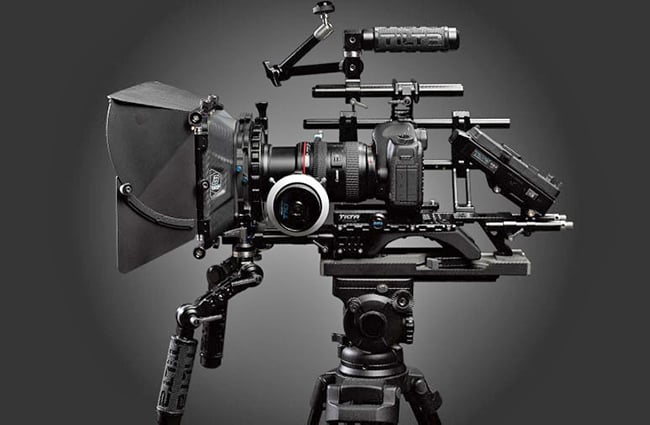 Is this ergonomic?
2. The disruptive influence of the DSLR
OK, we all know the DSLR video revolution has enabled people to produce fantastic images at very low cost but it has also had, I believe, a negative influence on camera ergonomics. It is, perhaps, unfair to criticise a camera primarily designed to take still pictures underachieving as a video camera, but what is disappointing is how stills cameras have reduced expectations of camera ergonomics. Because stills cameras need some sort of rig to be able to shoot video, an industry has grown up offering these rigs and so they have become, to some, standard equipment.
Yes, if your camera is going on a gimbal or a drone or even a tripod, you might think these arguments are irrelevant. Maybe they are in many circumstances. All I would say is the Frankenrigged camera has changed the way we make films. It goes against the evolution of cameras as being increasingly fast, flexible and unobtrusive. Or perhaps the expectation is, that if you want to shoot ‘fast, flexible and unobtrusive’, to use an iPhone. If you want to make ‘proper’ movies, you want something that turns you into a character from a Transformers movie. Really, with modern technology, there is no need for that dichotomy.
We have got to the stage now where a manufacturer like Panasonic can bring out a very impressively featured camera like the EVA1 but pass on the responsibility for making any sort of rigs or mounts to third parties. The argument here being, I guess, that the camera is small, light and flexible enough to fit a variety of different mounts and uses – so let the user decide. Is this the right way to go? You tell me.
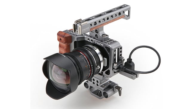 The Pocket Cinema Camera produces great pictures. But by the time it was made professionally usable it was anything but pocket sized!
3. The pocket camera which isn't
Specifically, the Blackmagic Pocket Cinema Camera. OK, I’m bound to make me a few enemies with this one. The estimable Simon Wyndham has already celebrated this camera on these pages as a Design Classic. For me it, it is a Design Fail. Sure, it can produce stupendous pictures for the price, people have made some lovely videos with it, but… just look at it. It looks like a snapshot camera that you can carry around with you in a (large) pocket, and whenever you want to make a video, you can whip it out, put it up to your eye like a snapshot camera. Except you can’t hold it up to your eye as it doesn’t have a viewfinder, so you hold it out to have the LCD screen at reading distance. And it shakes. There is no way of holding this camera steady without some sort of support or rig, which sort of defeats the whole concept of a pocket camera. And I could mention the fact the audio is awful, the batteries only last a few minutes, the autofocus is more or less unusable, the extra crop makes a lot of standard MFT lenses too long, but that would be churlish for a camera at this price point. So close to being a classic, yet failing. BUT…
I have to admit the new 4K Pocket Cinema Camera actually looks rather wonderful and has corrected some of those issues. It is even less likely to fit into a pocket and I still don’t know why it isn’t designed the way a video camera is designed, but its positive features and its bargain price point outweigh the strange design. OK, I admit, I have one on order. Just a shame about the shape.
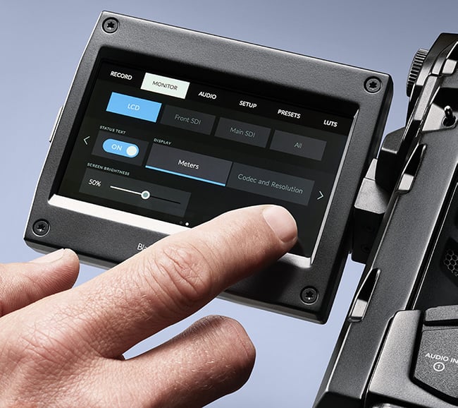 The Blackmagic Design camera interface. One of the few around that really gets things right.
4. Kafkaesque menus and buttons in the wrong place
Contrary to the above, this is an area where Blackmagic excels. Its menus are clear and sensible and seem to be designed by people who actually shoot video – but of course, Blackmagic is in the happy position of not needing to worry about the multiple options that stills photographers expect.
With too many cameras, the emphasis seems to be on giving the user the maximum control over every option – which, of course, is a good thing, but what we want prioritised are the functions we actually need to use all the time. This, of course, means the manufacturer needs a deep understanding of how the equipment is actually being used.
Buttons and switches, if designed properly, should never get you to inadvertently press the wrong one, even if you are in the dark, in a confined space or at an uncomfortable angle, or simply in a rush. But grab hold of some cameras when under pressure, particularly ones designed primarily to shoot stills, and it is Russian roulette as to what you have switched on or off.
Then there are the odd deviations from the intuitive that just seem perverse. Turn a lens ring clockwise and you will stop down, focus closer or zoom out. Right? But I bet you know a lens where one ring goes the other way. Why? Please, heaven tell me why?
5. Instruction manuals
Where do I begin? Japanese manufacturers are the worst for this, where the manual for a video camera – whether it costs you £500 or £50,000 – follows the same pattern. A lot of warnings with cryptic diagrams about not immersing the camera in water or pointing it at the sun or tying it to railway tracks (OK, maybe I imagined that one), then a very cursory list of menu functions which gives you really very little idea of what they actually do. Here’s an example from a current Sony manual on Picture Profile Settings:
PP5 Example settings of pictures recorded on cinema colour negative film
PP6 Example settings of pictures screened with cinema colour print film
Presumably, the first setting is not meant to actually create negative images, but to emulate a print from a colour negative. Then what is the second? Wrongly described colour reversal film (that no longer exists in movie form)? Is there anybody in the world who would find those descriptions in any way useful? Or even comprehensible?
The Panasonic DVX200, which I reviewed here a while ago, had a setting within the camera for ‘high sensitivity’, which gives you an extra stop but is distinct and separate from gain settings. The manual simply states ‘select this setting when recording in a dark environment’. Thanks. But what does it actually do? Surely the people who designed it knew – why couldn’t they tell us?
OK, we probably don’t read the manuals anyway. At one time, we could go out and buy a book (like the excellent ones by Barry Green to accompany Panasonic cameras). Now, they are much harder to find. Yes, there are many video tutorials on the web, of varying degrees of quality. These can be useful, of course, but they are no substitute for a written manual. And there are, of course, always a multitude of online forums where people will offer their own interpretations and recommendations. If you can cut through all the noise, you can eventually get some useful advice. But sometimes you just want to know just what the maker had in mind in the first place.
Rant over. I believe I am just scratching the surface here. If you have any particular frustrations with camera design, or if you think I’ve just got it all wrong, I’m sure you’ll let me know in the comments below.
Header image courtesy of Shutterstock.
Tags: Production


Comments