Replay: Dialogue scenes might not seem to offer many creative opportunities. But nothing could be further from the truth. Read on for some top tips on how to spruce up your dialogue scenes.
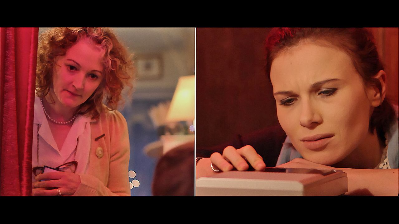
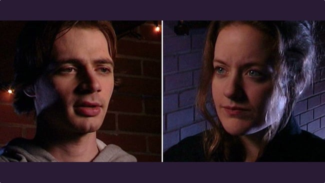
Two characters, standing or sitting opposite each other, delivering dialogue: it’s the bread-and-butter scene of any film or TV production. Typically, such a scene will be covered by a wide shot and a close-up on each character, and those two close-ups – one looking each way – are known as a shot/reverse-shot, or simply shot-reverse.
Conventional wisdom on shot-reverses says that the two shots should:
- be the same size
- use the same lens
- match the height of the respective eye-lines
- allow “nose room” (space on the side of the frame which the character is looking towards)
- frame the two characters on opposite sides of the screen.
In fact, once the first half of a shot-reverse is in the can, experienced camera assistants can be left to set up the second half by themselves, according to those rules.
Defining character
You can say a lot about the two characters’ relationship by how you choose to frame them. “Dirty” singles – where the other person’s shoulder or side of their head is in the edge of the frame – suggest characters more connected than “clean” singles. Even the amount to which the other person “dirties” the frame can symbolise the closeness of the relationship. In Crazy/Beautiful, for example, the filmmakers bring Nicole (Kirsten Dunst) and Carlos (Jay Hernandez) gradually become closer together in their shot-reverses as the film progresses and their romance blossoms.
I believe that there’s even more you can say about the characters if you let go of the idea that shot-reverses should also match. A simple example would be a nervous character shot with a handheld camera or from a high-angle, while the other, calmer, person’s shot is locked-off and at eye-level.
There’s a scene I love in the original Alien which breaks all the rules. Ash (Ian Holm) is in the medical bay, dissecting the face-hugger when Ripley (Sigourney Weaver) comes in to discuss the situation. He is framed in a low-angle mid-shot, placed left of centre, with Ripley dirtying the righthand side of the frame. Ripley’s single is completely different: she is framed in an MCU with the camera at her eye-level, and she is both placed on and looking towards the left of the screen.
Power through composition
Both characters are given power through composition but in different ways. His power comes from the low angle of the camera. Hers comes from being placed towards the closer end of some horizontal lines in the set. If she’d been placed on the tapering end of those lines, on the right of the frame, she would have no power in the scene at all, compositionally. I can’t say whether it’s intentional, but the fact that this compositional power – equal but different – matches the power the characters have in the dialogue and performance, is just exquisite.
So much for framing shot-reverses. What about lighting them? Here also exist opportunities to add subtext, but there is a dilemma.
Imagine you have a simple scene in which character A stands facing character B and they exchange dialogue. It’s night exterior so you’ve given A a blue backlight and a white front-light. Realistically then, since B is facing in the opposite direction, they should have a white backlight and a blue front-light. But do you really want one person’s face to be blue and the other’s to be white? Wouldn’t it be better for B to have a blue backlight and a white front-light, to match nicely with A? This is the dilemma.

When deciding whether to make your lighting realistic or matching, here are some things you might consider.
- Is the overall look of the piece stylised or realistic?
- Will the light that looks so great as a backlight on character A look unpleasantly harsh as a front-light on character B? (The answer here is usually yes. That is the whole reason cinematographers have to re-light when they do the reverses.)
- How clearly have the light sources been established in the wide shot?
- And perhaps most crucially, does lighting the characters differently help to underscore the power dynamics in their relationship, or enhance their characters in some way?
There is, of course, middle ground between matching and realistic reverses – tweaking the lighting so that an audience can still buy the continuity of it while it looks good on character B. Usually that is the middle ground we tread, but you will have to decide which style to lean towards.
Dialogue scenes often don’t seem like the most inspiring ones for a DoP, but I hope this article has demonstrated that there are plenty of important decisions to make which have a creative impact on the film. In a Camerimage workshop last year, Stephen Goldblatt (DoP of Lethal Weapon) made an excellent point about eye-lines, which I think equally applies to any decision about shot-reverses: “It’s not that important in an individual shot, but the cumulative effect over a whole feature is very powerful.”
Tags: Production


Comments