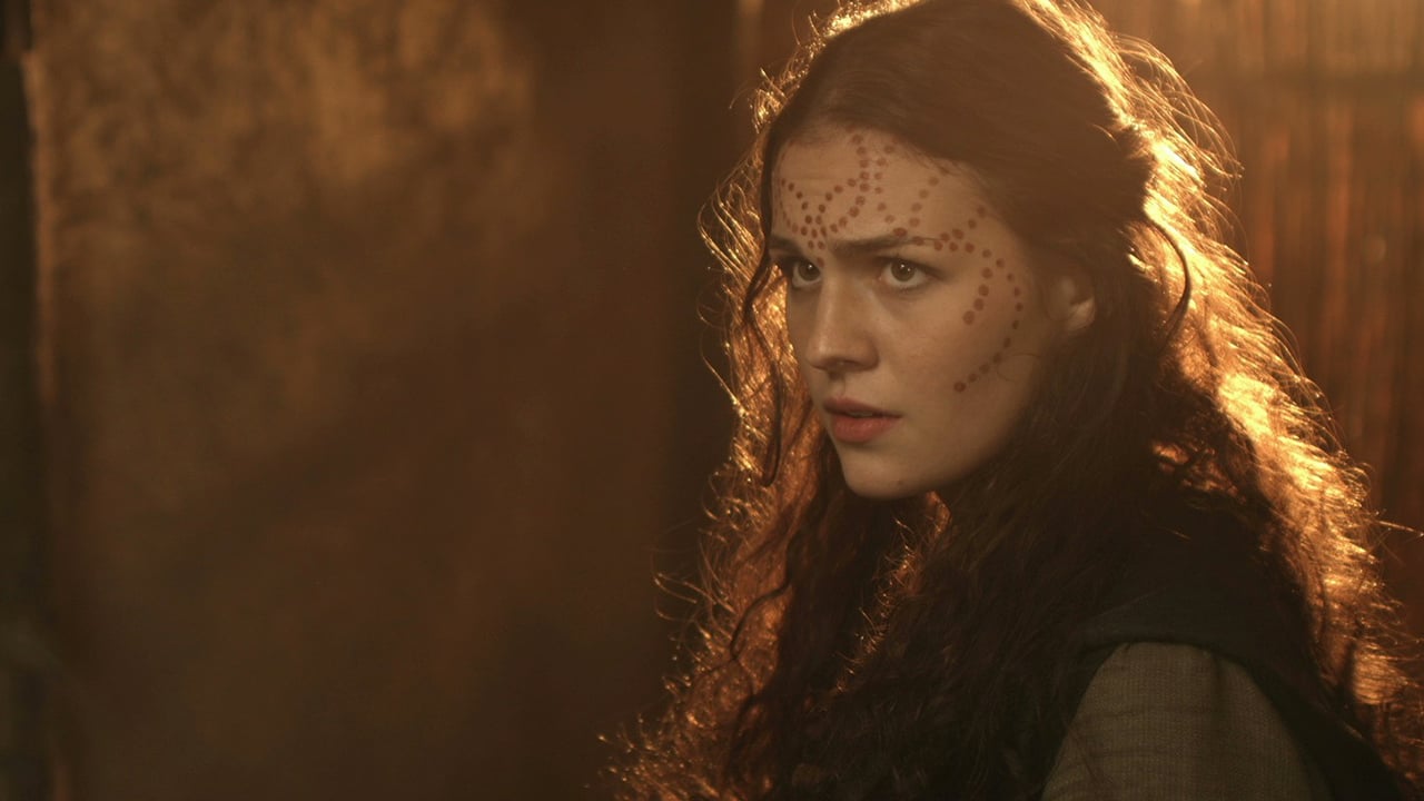
Replay: Character can be portrayed primarily through an actors performance. But cinematography plays an important part in enhancing character traits and our emotions towards them. DP Neil Oseman gives us his thoughts.
Actors, costume designers, make-up artists and set dressers all work hard to enhance character through their work. If you’re a cinematographer, you may not have thought yourself part of this process, but in fact, there are many things you can do. Here are some examples of how camerawork, lens choices and lighting can reveal characterisation.
Many years ago, I made a feature film called Soul Searcher in which the hero, Joe, was in unrequited love with a waitress called Heather. To show his nervousness whenever he talked to her, I shot his singles handheld, while hers were on sticks.
More recently, I photographed a short called Someone Else’s Shoes which also featured unrequited love. This time, I used wide lenses for the man, putting the audience right there with him and long lenses for the woman’s singles, suggesting she was being observed and loved from afar.
In a feature I once shot, called The Gong Fu Connection, the theme of forming connections and relationships with others was very important to the director. I came up with the idea of reflecting this in the way I composed singles: characters who were connected were shot as dirty singles, i.e. over the shoulder, while characters lacking these connections were shot as clean singles, isolating them in the frame.
For Perplexed Music, a recent short about a grieving man, I always squeezed him into the side of the frame, making him unbalanced and reinforcing his retreat from the world around him. At a key moment of catharsis, I switched to central framing to show his acceptance. The director and I also decided to use slight over-cranking, around 28 or 30 frames per second, to slow down the man’s movements, representing the burden of his grief.
Project specific rules
These project-specific rules are known as visual grammar and sometimes the director will have formulated them before the DP even comes on board. For a short I worked on called Coffin Grabber, director Claire Alberie had already decided that the film would be seen through the eyes of the film’s ten-year-old protagonist, Alfie, by shooting him from his eye-level with flowing Steadicam moves, while the adults were seen in static wides.
Depth of field is another creative tool that can be used to help character. Ren: The Girl with the Mark is a fantasy series about a young woman who becomes the host for an ancient and powerful spirit. I shot most of the series at T4, which is shallow, though not excessively so, but whenever the spirit took over I would stop up, sometimes as wide as T1.4, to make the background fall away completely and suggest the struggle within her.
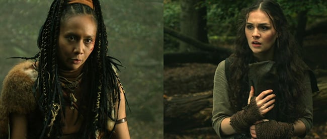
Ren: The Girl with the Mark - 2016 - Mythica Entertainment - dir. Kate Madison - DP Neil Oseman
Director James Reynolds wanted to use depth of field in a similar way for his short film Exile Incessant, which was all about the familial conflict between two generations of South Africans. James wanted to shoot the older, more bigoted characters with a shallow depth of field, to represent them being closed off from the world around them, while shooting the younger adults with a deep depth of field, suggesting a more broad-minded, inclusive view of the world. Unfortunately, our small budget meant that we rarely had enough light to achieve a small aperture. Instead, I suggested varying the quality of light on the two generations, using hard light, broken up by harsh shadows, for the older men who only see the world in (literally) black and white terms and softer lighting for the liberal youngsters.
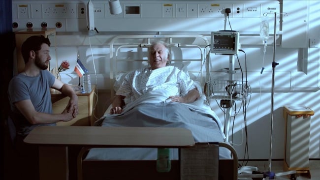
Exile Incessant - 2016 - Boris the Dog Films - dir. James Reynolds - DP Neil Oseman
I have used the hard/soft lighting technique in other productions too. Going back to Ren: The Girl with the Mark, I differentiated the naïve title character from the hardened warriors she encounters by using soft, even light on her and harder, more contrasty light on the others.
A short called Three Blind Mice was an anthology piece in which each of the trio of stories featured one character who was real and another who was supernatural or imaginary. As a subtle tip-off to the audience, I made sure that the unreal characters had perfect backlight and soft, even illumination across their faces, while the real people had a more natural, less manicured light.
A recent feature I shot called Above the Clouds has a homeless man, Oz, as one of its lead characters. He’s down on his luck, so I wanted even the lighting to give him a hard time! Whenever possible, I used what’s called a broken key on him. This is a key-light that’s very side-on, almost to the point of being three-quarter backlight, so that it casts unpleasant shadows on the face. As the film goes on and he begins to turn his life around, so the lighting becomes more flattering and comfortable.
Eye-light can be useful for characterisation. Usually, DPs want that little sparkle in a character’s eye, but sometimes not having it, can work for the story. A character without that sparkle might be dying or have given up hope, or have sinister plans. Sometimes I’ve even introduced eye-light mid-scene, such as in Above the Clouds where Oz decides to commit to an epic road journey with his new friend Charlie. I had the gaffer subtly slide a collapsible reflector in underneath the camera at the moment of decision, putting a glint into Oz’s eye.
Often the visual grammar evolves as you go along, particularly on features. After a week of shooting on the 17th Century supernatural thriller Heretiks, set in a convent, I realised that matt silver bounce (Celotex insulation board) was most effective on the tyrannical Mother Superior, while softer poly-board bounce worked best on the young novices.
Sometimes colours can be associated with different characters. In the upcoming The Little Mermaid, we are introduced to the title character in a tank in a circus ring. I used Steel Blue gels to give the water an exaggerated, magical colour. As shooting continued to later scenes, I found myself returning to the Steel Blue gels as “the mermaid’s colour” whenever she was on screen, reinforcing her desire to return to the ocean.
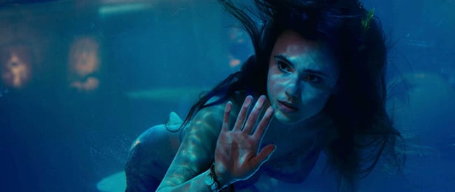
The Little Mermaid - 2017 - Conglomerate Media / Kingsway Productions - dir. Chris Bouchard & Blake Harris - DP Neil Oseman
I hope these examples get you thinking about how you can use camera moves, lenses and lighting creatively to help reveal character and enhance the story. In an ideal world, none of these techniques should be noticeable to the audience on a conscious level, but subconsciously they aid people’s understanding of the movie and add a lot of depth to the viewing experience.
Tags: Production

Comments