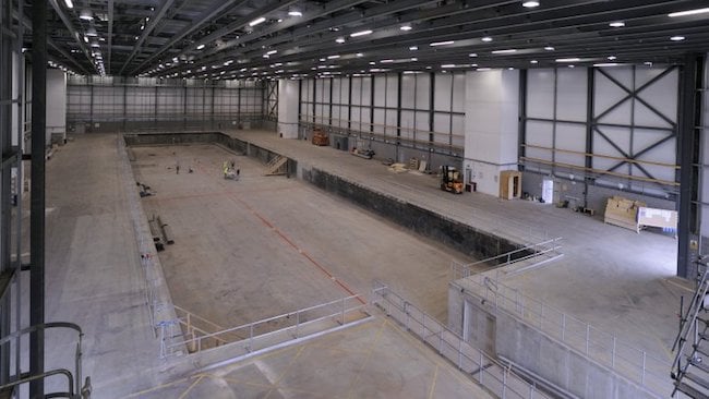
 Pinewood's famous 007 Stage: you want space? You got it
There has been a lot of discussion on these pages recently about what makes a film ‘cinematic’, centred around cameras, lenses, grading, lighting and the age-old debate of photochemical film versus digital. It’s all missing something obvious: space.
It easier to say what is not cinematic - pictures with harsh edges from sharpening circuits designed to compensate for lo-res images, blown highlights, smeary over-saturated colours, noisy shadows, 50i or 60i interlace, that plasticy, nasty, video look.
But everyone has their own idea of what that cinematic look is - many mid-range video cameras have ‘cinema look’ settings - few to me look anything like cinema. Shallow depth of field? - in the 1940s the cinema breakthrough was for deep focus. Anamorphic lenses? There’s certainly an anamorphic look, but anamorphics have always only been used on a minority of movies. Vintage lenses? It’s really a matter of taste and style - would anyone claim Birdman, shot with a pin-sharp Leica lens looks ‘uncinematic’? Dynamic range? Colour gamut? Digital cameras have (arguably) surpassed the ability of colour negative to record a wide range of light levels and colour, but, ironically, there is a trend in cinema today for smoky low-contrast images with a restricted colour palette. The raison d’être of many cinematic ‘looks’ on offer seems to be to get as far away from video as possible, but they bare little relation to the history of 20th century cinema. There are as many classic cinema ‘looks’ as there are classic cinema films.
And yet there remains in our minds a sense of something that is ‘cinema’ not ‘telly’ or ‘video’. I don’t think it is much to do with what model camera you use, but a lot to do with how shots are framed and lit, how the camera moves and how sequences are constructed out of those images to tell a story.
So I have another element to throw into the discussion: space. Part of what movies look like movies is that they can afford to shoot in studios or large location spaces. That makes it hard for micro-budget indies to compete, whatever camera they have.
The current vogue for shallow depth of field means large sensor sizes enabling longer focal length lenses for the same angle of view (let’s be clear: depth of field for a particular camera to subject distance is dependent on two factors: focal length and aperture). We are using longer focal length lenses, but we are not using narrower angles of view. Those of us brought up on Super 16mm and 2/3” video instinctively move the camera further away from the subject (to use a longer lens and throw the background out of focus) than those raised on DSLRs. People now are using wider angles and shooting closer, simply because they can.
Using a large set means you move the camera away, you can use longer lenses, you can play with perspective, the space can be compressed or expanded, actors can be brought together or pushed apart without them actually moving - this can have a big impact on the emotion of scene. If you have the technology, to move through the space, not just shift laterally on a slider.
Then, of course, there is the matter of lighting. Everyone loves soft light (there’s also a lot to be said for hard light, but I’ll leave that for another article). To get really soft light you need big diffusers or big bounce boards (classically, an 8’ x 4’ piece of poly - or ‘foamcore’ if you are in the USA). Big light sources take up space and, crucially, in small spaces the light bounces around uncontrollably. Soft light in small spaces, particularly those with white walls, easily becomes very flat and bland. The key to many great looking movies is that they achieve very soft light that wraps around the subject yet still maintain inky-black shadows - the light is soft but not flat. Creating that look in a big studio with black walls is one thing, doing it in a domestic living room is quite another.
In a large space you can light characters and objects individually, you can let shadow areas go really dark, you can give space between actors and the walls behind them. By using a powerful key light well away from the set, fall-off is reduced and the actors can be evenly lit with one source - a large set gives you the chance to light more simply as well as more intricately. Lighting in a cramped space is just very difficult - that, I believe, is the reason for the ‘flatness’ of scenes from low budget films, and no amount of camera trickery can compensate for that.
So, if you have no money but want to shoot a ‘cinematic’ looking drama, what do you do? I would urge you to find the biggest space you can and, failing that, paint the walls in shot a couple of tones darker than you would expect them to be and the walls out of shot, paint black or hang black drapes. Filmmakers just starting out tend to undervalue location and production design - they are more crucial to the look of a film than the brand of camera. And a pot of paint is cheaper to buy than a lens is to hire.
Tags: Production


Comments