
The Rule of Thirds is holding back newcomers, argues Rakesh Malik, because slavishly using it doesn't really help you learn how to compose a compelling image and understand or control the viewer's eye.
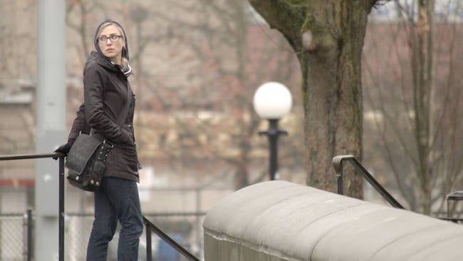
We'll dive right in. For example, here's an image from a trailer that was not designed using the rule of thirds.

(Image copyright Underlig Media)
The large concrete wall in the foreground draws the eye because it has so much visual weight from being a large part of the frame, in the foreground, relatively bright, and in a corner. It forms a leading line that guides the eye to Tabitha, who is a bit closer to the left edge of the frame than a third, some would say too close to the edge of the frame. The slightly out of focus tree and lamp post behind Tabitha form barriers in front of and behind her, and with her looking over the shoulder, she’s looking off of the frame because of how close she is to the edge of the frame.
The director wanted a feeling of anxiety, because the story he wanted to convey was one of paranoia and fear, where the main character, played by Tabitha, believes that she is being pursued (because she is), but doesn’t know by whom. Her placement looking over her shoulder into the edge of the frame leads the viewer to expect a cut to show what she sees, adding a bit more tension to the shot.
This frame is also slightly unbalanced. The combination of having Tabitha being close to the left of the frame plus the significant visual weight of the wall that guides the eye to her puts a lot of visual weight toward the left, that is not completely balanced out with the elements on the right of the frame. This was intentional, as it enhances the feeling of anxiety, and is also something that the rule of thirds does not help you to compose.

(Image copyright Mackaroni Productions)
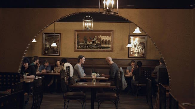
In this example we have an image with the two main characters in the centre of the frame, surrounded by a dome and several secondary characters and extras. The scene revolves around the two leads, but some of the secondary characters have a significant role here, foreshadowing the climax of the film. This composition places the two leads in centre of the frame, which is of course a big no-no when following the rule of thirds, once again indicating that adhered to the rule of thirds would have forbade this framing.
The combination of leading lines on the left and right plus the archway that frames the table where the two characters are seated guides the eye to them, even though the other characters in the frame will attract a bit of attention due to their movement. In addition to giving the restaurant scene a feeling of being alive, this keeps the viewer's attention on the two characters at the centered table. The lighting also enhances this; the two leads have rim lights as well as beauty lights, but the rest of the cast does not, letting them fade a little more into the background.

(Image copyright Underlig Media)
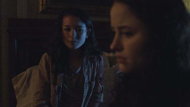
This image from Siren's Song nearly follows the rule of thirds, but by coincidence. The two girls here were arranged around their mood; facing us is Katrina, and facing to the left is her best friend Amber. Katrina has recently discovered that she has some supernatural abilities, which set her apart, and while she wants to stay in the familiar, she is being forced into the unfamiliar. Amber is sitting facing toward the left, toward a warm and comforting light, while Katrina is divided between the desire to stay in the warmth and comfort, but having been thrust into something new and terrifying. The cool light on her face from the right divides her face by warm and cool, highlighting her conflict.
To further enhance the feeling that Katrina's future is fraught with peril, we placed the light on the right low enough to give a slight upward angle to it, using the underlighting to enhance the mood of the scene.

(Image copyright White Crane Photography)
This image from Torres del Paine, featured in a print exhibtion in the Louvre, also shows a design based on leading lines. I noticed this composition early in the morning as we headed out toward the French Valley, but I captured it in the evening when we returned, waiting for the sun to get lower in the sky, crosslighting the landscape and casting sidelit shadows on the walls of the foreground valley. I headed for this spot where the converging valley walls drew the eye toward the Paine Massif, framing the jagged blue peaks with the valley walls, with the waves of grasses in the foreground helping to attract the eye. This design encourages the viewer to follow the shape of the valley to the Massif, while continuing to attract the eye to the foreground, inviting a deeper look.

(Image copyright Alien Crane Productions)
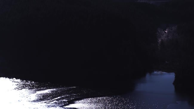
This last image shows a composition that makes use of negative space and two points of visual interest to draw the eye back and forth across the frozen lake below. The negative space provides a frame for the image, giving the eye a route through the frame. The island draws the eye to the left part of the lake, and the boats on the right draw the eye back to the right. The texture of the ice and water in the lake add some interest in the lake's surface, helping to balance out the negative space.
But what about movement?
While a lot of filmmakers describe the process of designing moving camera shots using the term "keyframes" borrowed from animation, I prefer to draw on Henri Cartier-Bresson’s work instead. His street photography did a wonderful job of conveying a story with a single captured moment, that he referred to as "the decisive moment." Thinking about the most important moments of a shot, the high points of the emotional arc, turning points in the conflict, a cinematographer can plan a shot from moment to moment, crafting shots that enhance the actors' performance.
It's about time that we set aside the rule of thirds and got back to storytelling.
Tags: Production


Comments