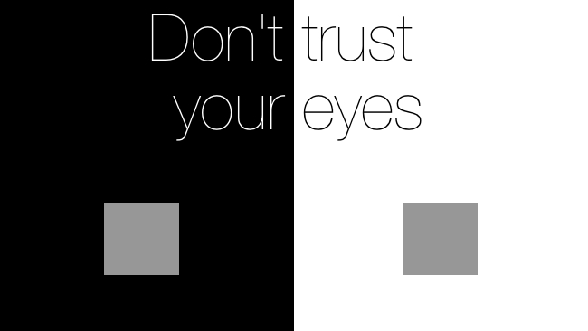
 Don't trust your eyes
Our eyes don't work like a camera set to "manual" mode. They're set to "automatic everything" and you can't turn it off. In fact, the very means we use to identify a colour depend on the surrounding hues. This, to put it mildly, can lead to mistakes
Ever heard of simultaneous contrast effect or simultaneous colour effect? If you work in post-production then you need to know about it; it could be distorting the way you look at your work and affecting the quality of the films you produce.
Many people don’t go much further than arranging their lighting to minimise reflections on screen, and overlook the fact that the colours in the room can completely change the look of a shot.
The below video demonstrates how your perception of a colour is altered by the shades around it. It’s easy to dismiss as an optical illusion, but when it affects the quality of your work it’s something that needs serious consideration:
Theory to Implementation in the Edit Suite
As a colourist at The Den at Lion Eyes, a full service production boutique, I trawled through research before putting the theory into practice in our edit suite and came up with the ideal surroundings for our edit suite.
Our walls in The Den at Lion Eyes are 18% grey; this is standard for grading suites as it’s a true neutral shade. Whether you use paint or fabric is debatable but paint should be spectrally flat so that light doesn’t bounce off the walls. You’re unlikely to find the specialist paint you need in a household store but there are various places to get it online. Ideally, all the walls should be the same colour, but if necessary use clever lighting to darken all other walls.
Lighting is crucial; if your eyes are compensating for excessive or insufficient contrast between the screen and your environment, what you see on screen won’t be the true image. All of the light sources in the room should give a white daylight, which comes from a 6500k bulb. Calibrate all monitors in your field of view to 6500k too, to stop your eyes from making adjustments for the difference between the two and ensure your perception of the image on the screen is correct.
It’s not unknown for a director to exclaim that a shot “looked completely different” on set to how it looks in the grading suite, even though the monitors on set and in the grading suite were both properly calibrated. That’s because of the influence of all those external factors on set, the lighting, the gels, the location itself, which have affected their perception of the image on screen. Counteract simultaneous colour effect and be confident that your grading is as good as it can be, and you aren’t being hampered by your own environment.
It helps to have a few nice spare chairs and biscuits in your post production room too, so that the editor can sit comfortably while you explain it them.
By Craig Leedham, colourist at the Den at Lion Eyes, an award-winning full service production boutique specialising in planning and producing moving image productions for brands, television, personalities and agencies worldwide.
To view examples of The Dens’ productions visit www.thedenpost.co.uk
Tags: Post & VFX


Comments